UI/UX šŸ’© / Feedback

feedback

Load previous messages

June 29, 2019 at 5:31pm

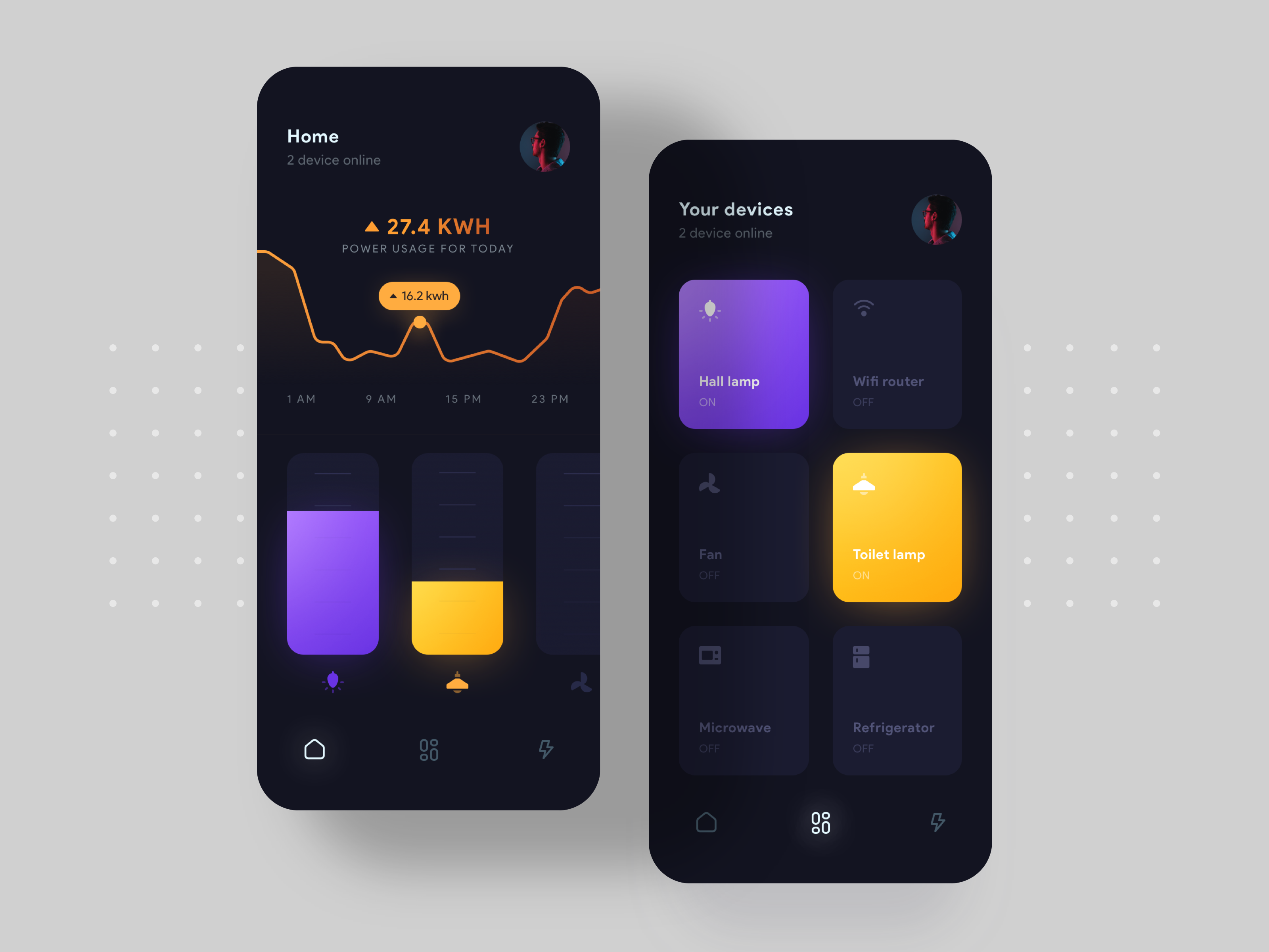
Looks great. Love the gradients!

    like-fill
    1
    • reply
    • like

    June 30, 2019 at 6:22am

    Status text on disabled devices is a bit hard to read (maybe it's just me). I mean "ON/OFF" labels. If the font is "thin" - I'll advice to make it regular. If it's regular - make it medium or bold (then device name will go bold/black). Experiments needed :D

      Yeah Thatā€™s right , thank you for your feedback.

        like-fill
        1
        • reply
        • like

        Looks great. Love the gradients!

          Thanks a lot :)

            • reply
            • like