Join the conversation
Sign in to join this conversation, and others like it, in the communities you care about.
More active conversations
What is best and most efficient tool between Figma and Adobe xd
3 messages
Freebie UX/UI Kits
1 message
I just completed a Banking/Finance sector project. Please do check and let me know your feedback :)
0 messages
Repetition is the recurrence of a design element, commonly utilized in patterns or textures. Repetitive elements can be used in conjunction with other principles to create a design that leads a user’s eye to a focal point, has continuity, or flow. A repetitive element could be repeated lines, shapes, forms, color, or even design elements.
0 messages
What is Activity Centered Design
0 messages
UI/UX 💩 / Feedback
What project are you working on?
What project are you working on?
UI/UX 💩/Feedback · March 27, 2019 at 3:02pmWhat project are you working on?
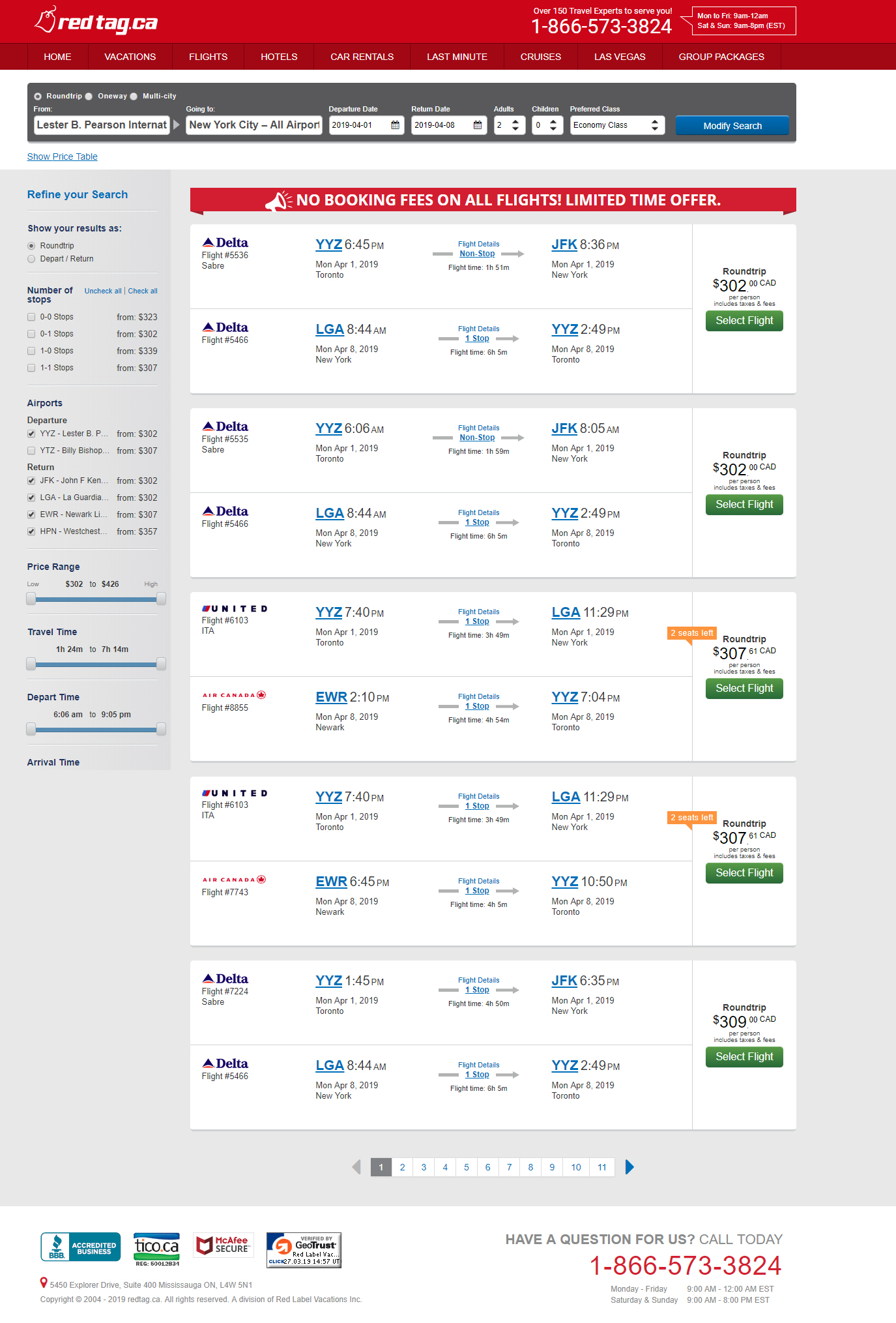
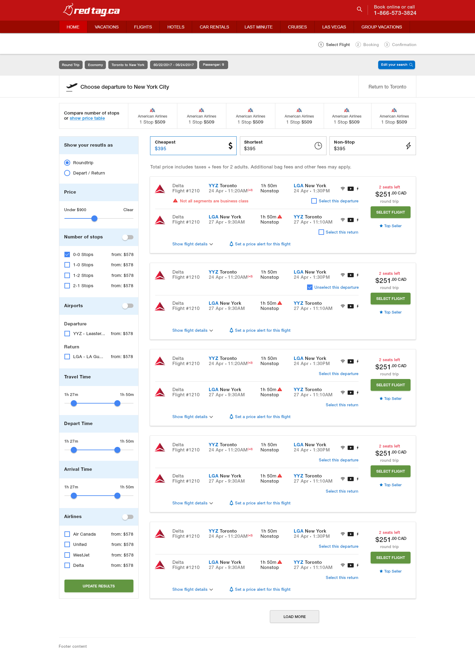
UI/UX 💩 / Feedback · March 27, 2019 at 3:02pmThought this would be interesting. Share what project you are working on this week/month. I'll go first. I am currently redesigning redtag.ca flight page. This will be responsive therefore desktop to mobile.
Current version
New
March 27, 2019 at 6:10pm
Interesting thread Fahim. This and previous months I was working on this Vanila Community.
Interesting thread Fahim. This and previous months I was working on this Vanila Community.
Awesome. Is this platform becoming an app anytime soon?
I designed landing page in very short amount of time, cause I couldn't dedicate it full time since i needed to focus on other aspects of this app, and prepare for lunch
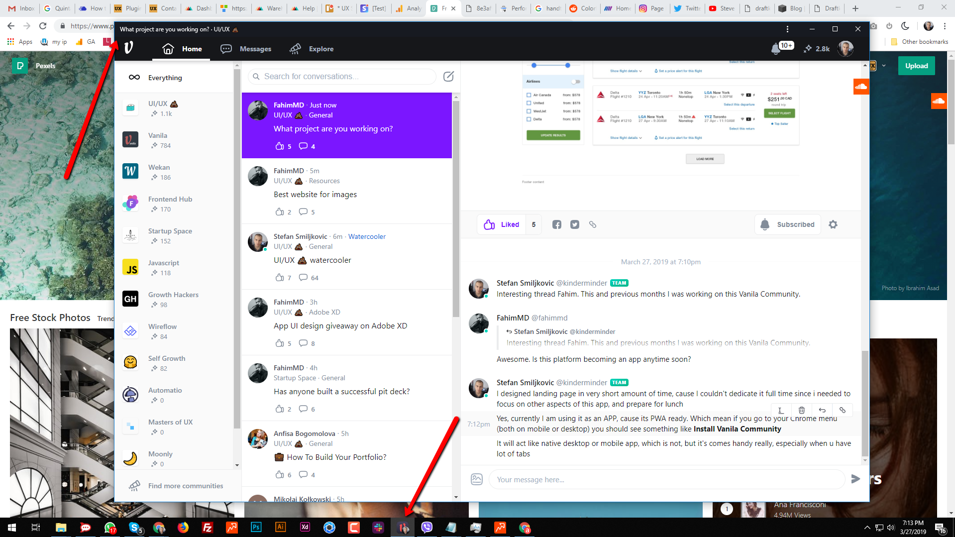
Yes, currently I am using it as an APP, cause its PWA ready. Which mean if you go to your Chrome menu (both on mobile or desktop) you should see something like Install Vanila Community
It will act like native desktop or mobile app, which is not, but it's comes handy really, especially when u have lot of tabs
as you can see on screenshot below, its pinned to my taskbar
and its totally separated from Chrome / browser tabs
March 28, 2019 at 12:52pm
@kinderminder Looks great so far, I am using Spectrum (love the UI in that) as vanila community suggested me in menu (via desktop app), but I couldn't find this ui_ux thread. Can't wait for this one to be live. Or is it yet and I am just blind...
March 28, 2019 at 7:08pm
Right now, I’m working on a redesign of my most popular app, Que (https://www.producthunt.com/posts/que) and other small things
March 28, 2019 at 10:47pm
@kinderminder Looks great so far, I am using Spectrum (love the UI in that) as vanila community suggested me in menu (via desktop app), but I couldn't find this ui_ux thread. Can't wait for this one to be live. Or is it yet and I am just blind...
Hey Lisa, glad you like LP. And yeah Spectrum is awesome, and something I wanted to use from first day. They changed completely UI now, and it doesn't have anymore same feeling.
Btw, didn't understand what you can't find? What thread ?
Right now, I’m working on a redesign of my most popular app, Que (https://www.producthunt.com/posts/que) and other small things
I would add overlay color black ( or some else) on that background with ~60% transparency, so it put focus on the login elements CTA. So far, so good, keep us with update G :)
March 29, 2019 at 6:46am
I'm working im my most recent website https://www.colorffy.com ✨ and I'm trying to make it a better website with feedbacjk, comments, etc. 🙌
March 29, 2019 at 8:41am
@giancarlosgza nice work! Personally, I would make a bigger space between links (and on homepage, between headline and subtext). With bigger spacing it will breath a bit more. Otherwise looks good!
March 29, 2019 at 10:14am
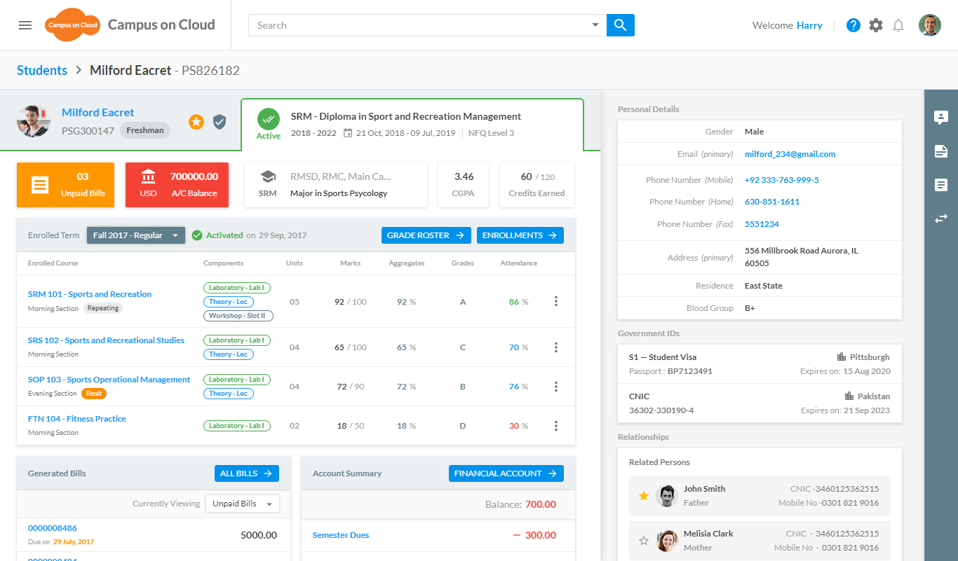
Just finished working on a student 360 view. It was one the most challenging design because 360 views have lots of data and in order to accommodate each and every thing into a single view was a tough task. AND I TRIED MY BEST :D
March 29, 2019 at 4:58pm
Unfortunetly I can't put here design I'm working on right now because of an agreement. However I start learning some kind of motion design and micro-interactions. :) I found it very creative and fall in love with this. :)
March 30, 2019 at 12:24am
@giancarlosgza nice work! Personally, I would make a bigger space between links (and on homepage, between headline and subtext). With bigger spacing it will breath a bit more. Otherwise looks good!
Thanks! I'm gonna add the space, right now! 😊🙌
April 2, 2019 at 1:48pm
Hey fellas, I would love to know your opinion on an app that we are currently working on. It's basically a job finding app with the "Tinder" touch (should be that much easy, just swiping and stuff), but it's focused on modeling and stuff around it (like when your company need to shoot some product and need a model for that, or you need a model for your event to smile and give badges to people, etc.). Details are not 100% developed now, im missing some details like tags, but I am trying to find the right interface mood combination. Our main color is purple, so im playing with that and I have 3 versions. Your opinion would help me a lot! Thanks
and its totally separated from Chrome / browser tabs
pinned!
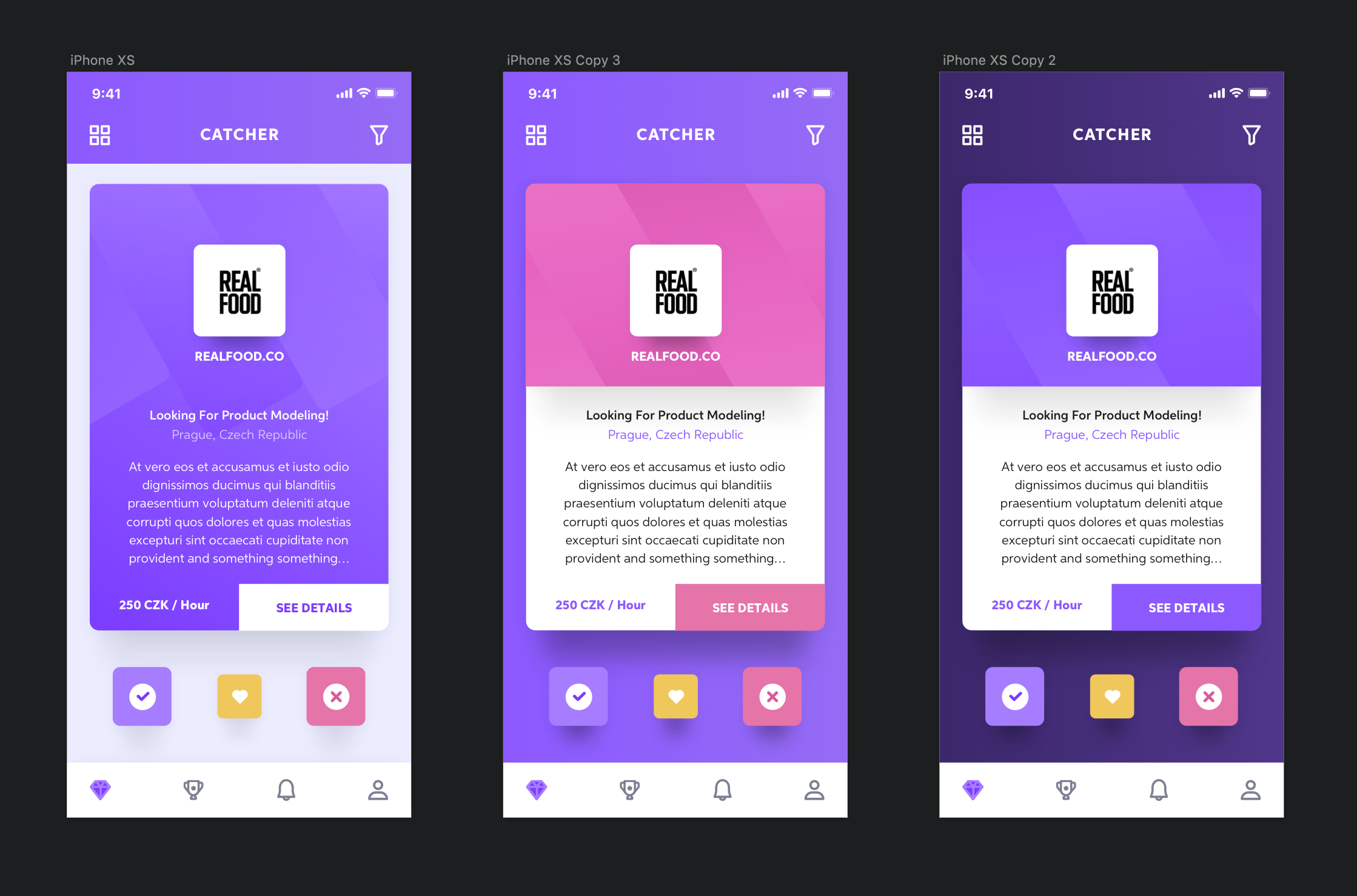
the one I like the most is the one on the left but I find the See Details more important and connected to the job offer than the Checkmark or X at the bottom. I think those should be the main actions and the see details should be less important. Also in this case of YES or NO I would go with Green for the Checkmark, I wouldn't brand it with the app colors! I hope this is helpful and makes sense!
the one I like the most is the one on the left but I find the See Details more important and connected to the job offer than the Checkmark or X at the bottom. I think those should be the main actions and the see details should be less important. Also in this case of YES or NO I would go with Green for the Checkmark, I wouldn't brand it with the app colors! I hope this is helpful and makes sense!
Oh yeah, that's helpful. Im gonna switch to the green for yes mark instead of brand color. Currently the main action you gonna do is swiping - like in tinder. Swipe left or right to accept or decline, so those buttons down are more like... completing? Extra? You know what I mean.
My main question is how to suit the app, if 1 (grey back and purple card), or purple back with some secondary color, or dark purple with the main purple for card... You know. Would love to hear opinions.
And thanks for the checkmark tip!

.png?expires=1730678400000&ixlib=js-1.2.1&s=62cf89977512001937b0e5fcd7d5ce11)
