Join the conversation
Sign in to join this conversation, and others like it, in the communities you care about.

More active conversations
What is best and most efficient tool between Figma and Adobe xd
3 messages
Freebie UX/UI Kits
1 message
I just completed a Banking/Finance sector project. Please do check and let me know your feedback :)
0 messages
Repetition is the recurrence of a design element, commonly utilized in patterns or textures. Repetitive elements can be used in conjunction with other principles to create a design that leads a user’s eye to a focal point, has continuity, or flow. A repetitive element could be repeated lines, shapes, forms, color, or even design elements.
0 messages
What is Activity Centered Design
0 messages
UI/UX 💩 / Feedback
feedback
feedback
UI/UX 💩/Feedback · June 18, 2019 at 4:29pmfeedback
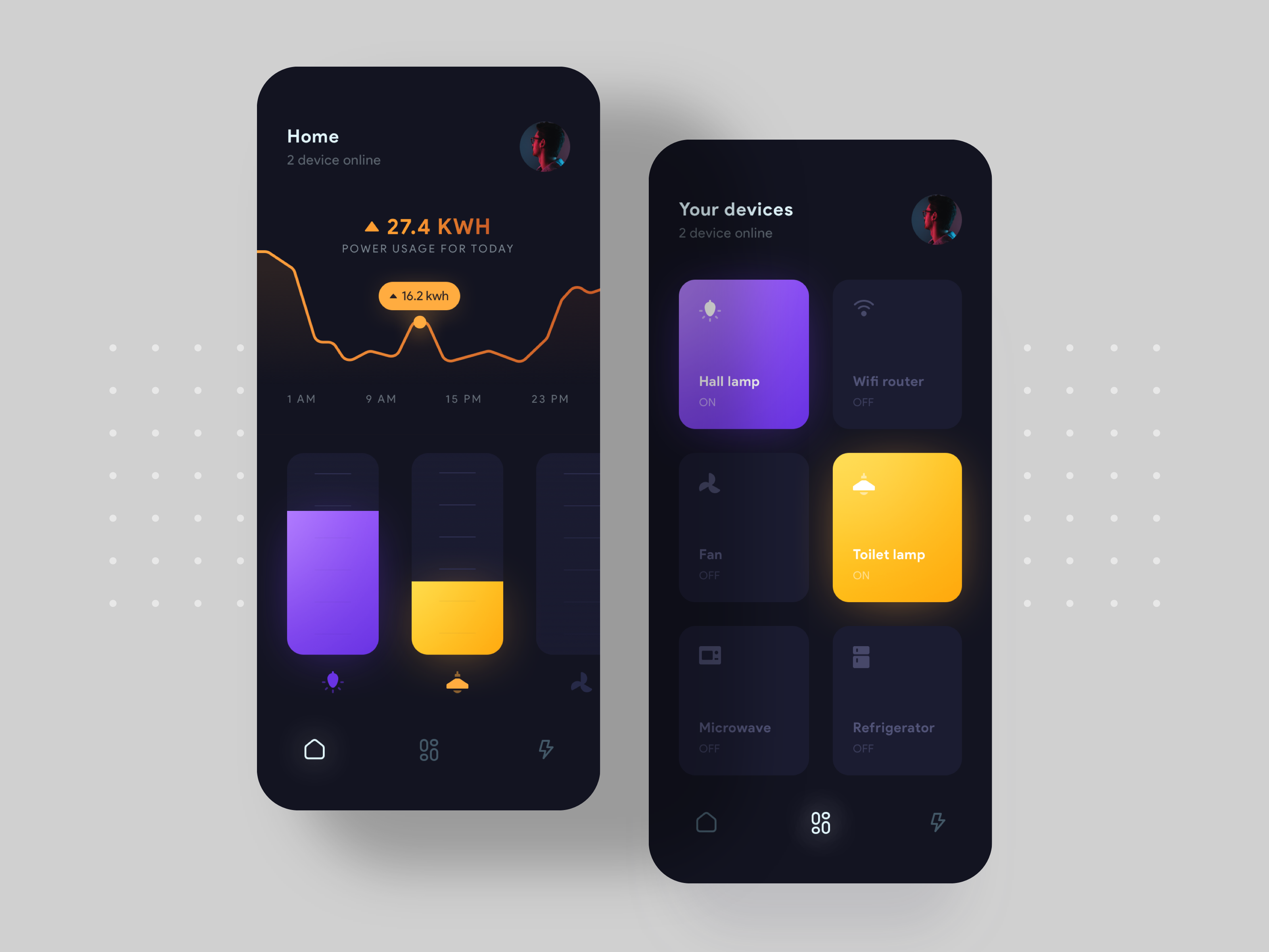
UI/UX 💩 / Feedback · June 18, 2019 at 4:29pmSmart home Concept 📱💡 https://dribbble.com/shots/6632068-Smart-Home-Concept
June 19, 2019 at 9:58am
Looks cool, thanks for sharing. Btw, it would be good to add in Title of this thread the concept name in this case Smart Home Mobile UI Concept
Thanks :)
June 19, 2019 at 11:13am
The second screen has some page scroll as the first one? At the first is very clear that has a scroll and where to scroll to see more. Nice colors
June 24, 2019 at 2:39pm
The second screen has some page scroll as the first one? At the first is very clear that has a scroll and where to scroll to see more. Nice colors
thank you ☺️
June 26, 2019 at 1:32am
@danielvichi u are talking about intuitive scroll like this example https://www.instagram.com/p/BzBIdB-DiDq/
June 26, 2019 at 10:52am
@danielvichi u are talking about intuitive scroll like this example https://www.instagram.com/p/BzBIdB-DiDq/
Exactly! Thanks
June 26, 2019 at 12:19pm
Status text on disabled devices is a bit hard to read (maybe it's just me). I mean "ON/OFF" labels. If the font is "thin" - I'll advice to make it regular. If it's regular - make it medium or bold (then device name will go bold/black). Experiments needed :D
June 29, 2019 at 5:31pm
June 30, 2019 at 6:22am
Status text on disabled devices is a bit hard to read (maybe it's just me). I mean "ON/OFF" labels. If the font is "thin" - I'll advice to make it regular. If it's regular - make it medium or bold (then device name will go bold/black). Experiments needed :D
Yeah That’s right , thank you for your feedback.
Looks great. Love the gradients!
Thanks a lot :)