UI/UX 💩 / Resources

Introducing Checklist Design!

Introducing Checklist Design!

UI/UX 💩 / Resources · March 27, 2019 at 7:26am (Edited 6 years ago)

Hello everyone.

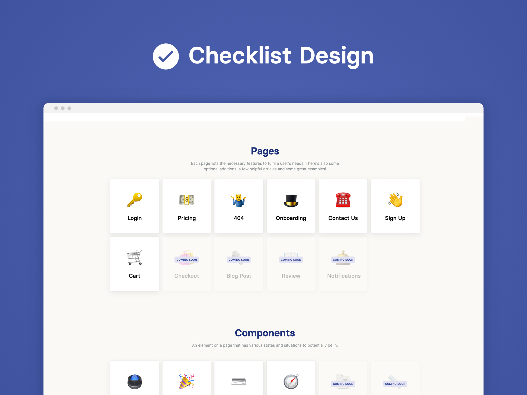
Today I'm sharing a website I made that focuses on the best UI and UX practices for design - Checklist Design! The aim was to showcase features, examples and articles for you to utilise in your work to have functional, accessible design.

Take a look and enjoy, would love your feedback! https://www.checklist.design/
checklist-dribbble-post.jpg

March 27, 2019 at 7:35am

Oh man @george , I am so glad you joined ^^. Great work on Checklist Design, very useful resource. I will definitely feature it on UI__UX Instagram network later today.

    Edited
    • reply
    • like

    I am wondering did you made it with Webflow ? :)

      • reply
      • like

      Btw, you forgot to add link to the website. Make sure to edit post :)

        • reply
        • like

        Thanks for the invite @kinderminder 😊 and for the kind words!

        I did indeed make it with Webflow, I've got it on Showcase at the moment: https://webflow.com/website/Checklist-Design

        Just editing for the post, can't believe I forgot haha.

          like-fill
          1
          • reply
          • like

          Thanks for the invite @kinderminder 😊 and for the kind words!

          I did indeed make it with Webflow, I've got it on Showcase at the moment: https://webflow.com/website/Checklist-Design

          Just editing for the post, can't believe I forgot haha.

            Hehe, somehow I felt its made with Webflow. Thanks for sharing that link, didn't know you can publish it on their showcase

              • reply
              • like

              March 27, 2019 at 10:05am

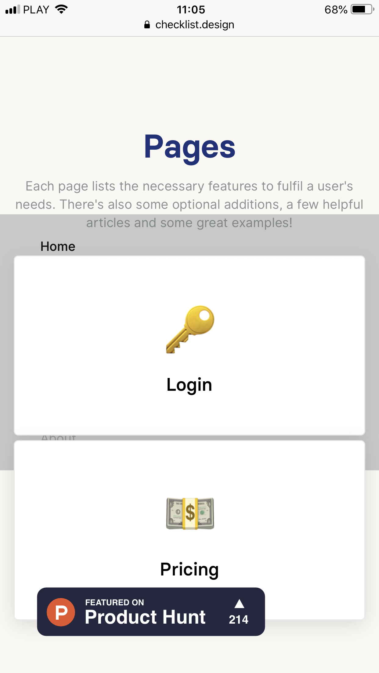
              This is great! I mean idea and work! Very clear, very usefull and after reading this you are sure you didn’t forgot about anything. Anyway there is one issue in this. I mean in page working. I’m using Iphone 7plus and after clicking on menu in top right corner it appears way down behind the „Login” with key icon.

                • reply
                • like
                • reply
                • like
                • reply
                • like

                March 27, 2019 at 12:20pm

                Thanks for that @kolkowskimikolaj! Will have to work on that fix very soon, I didn't realise.

                  • reply
                  • like

                  March 27, 2019 at 11:33pm

                  Awesome man I'll check it out tonight! 🤙

                    • reply
                    • like

                    March 28, 2019 at 12:48pm

                    Awesome work. Really helpful, especially when you are trying to dig into UX work more and creating new wireframes. Love it, keep up the great work!

                      like-fill
                      1
                      • reply
                      • like

                      March 29, 2019 at 6:55am

                      @george Hey George. I wanna share some feedback.

                      1. When I choose one of the Pages, All the cards that show up on the left side look clickable, but are not.
                      2. It would be really useful to actually show some good examples for each of the points that you mention for that page.
                        like-fill
                        2
                        • reply
                        • like

                        March 30, 2019 at 7:03am

                        Wow, this definitely is gonna help me with my UI/UX

                          like-fill
                          2
                          • reply
                          • like

                          April 2, 2019 at 2:10pm

                          this is awesome

                            like-fill
                            1
                            • reply
                            • like