UI/UX 💩 / Tips
Designing for Bigger devices. New rules?
Designing for Bigger devices. New rules?
UI/UX 💩/Tips · May 31, 2019 at 5:04amDesigning for Bigger devices. New rules?
UI/UX 💩 / Tips · May 31, 2019 at 5:04am
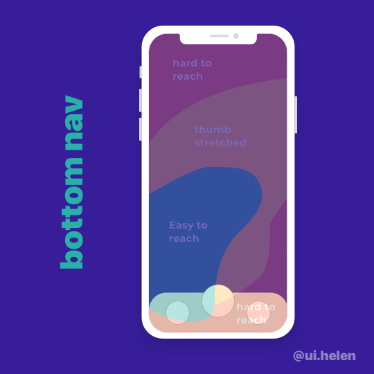
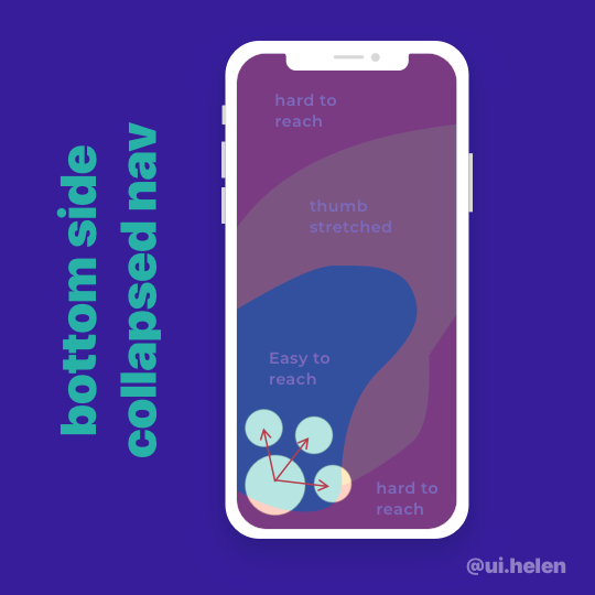
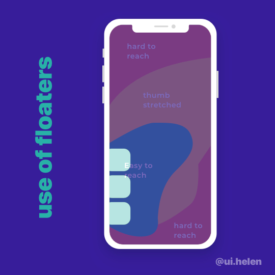
As devices we use are getting more and more bigger it is important that we think about ergonomics. Think about how you had your iPhone max and couldn’t reach top hamburger menu because the screen is too big and your thumb couldn’t reach it with one hand. . Frustrating right? . We will need to change the navigation pattern that we use now to support bigger screens. . As we usually use a thumb to tap on the screens (especially when we already have our Starbucks in the other hand) so all important navigation elements have to stay within a zone that is easily reachable by a thumb. . . My own experience of designing for bigger devices:
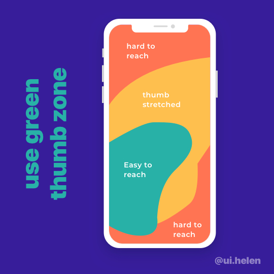
- I try to keep most used navigation elements at the bottom
- I keep rarely used navigation at the top
- I tend not to use hamburger menu anymore as it is the hardest to reach
- For the secondary navigation I have recently tried floaters
- I am discovering the potential of using bottom side collapsed nav (main action that collapses into multiple options) . Would be nice to hear fellow colleagues opinion on this. How do you design for bigger screens? What changes have you applied? . . .