Join the conversation
Sign in to join this conversation, and others like it, in the communities you care about.
More active conversations
What is best and most efficient tool between Figma and Adobe xd
3 messages
Freebie UX/UI Kits
1 message
I just completed a Banking/Finance sector project. Please do check and let me know your feedback :)
0 messages
Repetition is the recurrence of a design element, commonly utilized in patterns or textures. Repetitive elements can be used in conjunction with other principles to create a design that leads a user’s eye to a focal point, has continuity, or flow. A repetitive element could be repeated lines, shapes, forms, color, or even design elements.
0 messages
About Case study
0 messages
UI/UX 💩 / Tips
why the shopping cart always on right?
why the shopping cart always on right?
UI/UX 💩/Tips · April 3, 2019 at 6:05amwhy the shopping cart always on right?
UI/UX 💩 / Tips · April 3, 2019 at 6:05amis there any reason to do that please tell me
April 3, 2019 at 6:32am
Hey Rajesh, can u explain more what u mean by that ? Like if u provide a screenshot of examples would be easier to understand
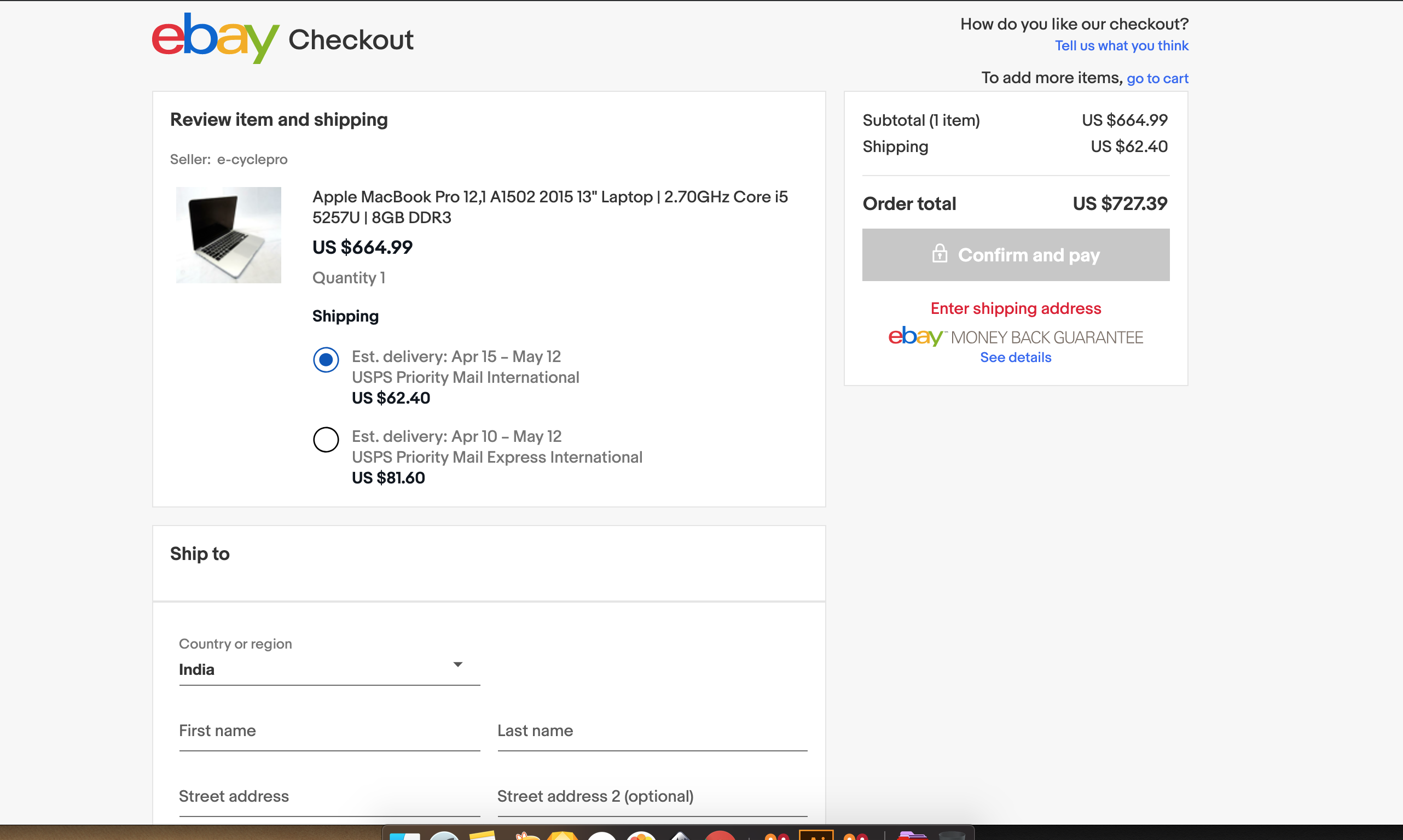
in above picture you see that the place order btn is on right side why?
thats the thing i have know can you help me @kinderminder
in ebay it also same
its probably cause we read from left to right. So in left they display important information
Thank you @kinderminder
hehe, yw buddy. I guess that is most common reason. Lets see what others have to say
For me, i think because it's easier to see. People eyes naturally look up into up right corner of the screen.
April 3, 2019 at 10:39am
It's probably just to do with trend. Most likely some popular shopping website did it and new websites just felt like that's what we are now naturally used to.
April 5, 2019 at 4:35pm
More like social convention. But as we tend to ~try~ explaining things our inconscient mind receive and react to, professionals of many fields always come up with something like "its easier to see" (indeed), "important stuff should be on the right side" (it may be), "we got a natural perception that 'our right side' gives out more space than the left side" (we got a neuroscience explanation to many things concerning perception so yep, it may "give out more space"). The truth is, as everyone's wrong because there's no logic reason, everyone's right. We are now used to it, our brains can't "unsee" the logic we have assigned to the signs we create since the very beginning of times, like more than 20k years before inventing language. So when in doubt: be the fish that swims with the river, not against its flow if theres no possible reason for that. Stick with ~trends~. More like making mistakes and learning from them.


