Join the conversation
Sign in to join this conversation, and others like it, in the communities you care about.
More active conversations
What is best and most efficient tool between Figma and Adobe xd
3 messages
Freebie UX/UI Kits
1 message
I just completed a Banking/Finance sector project. Please do check and let me know your feedback :)
0 messages
Repetition is the recurrence of a design element, commonly utilized in patterns or textures. Repetitive elements can be used in conjunction with other principles to create a design that leads a user’s eye to a focal point, has continuity, or flow. A repetitive element could be repeated lines, shapes, forms, color, or even design elements.
0 messages
What is Activity Centered Design
0 messages
UI/UX 💩 / Feedback
Dark mode for a productivity app, what do you think?
Dark mode for a productivity app, what do you think?
UI/UX 💩/Feedback · June 25, 2019 at 6:09pmDark mode for a productivity app, what do you think?
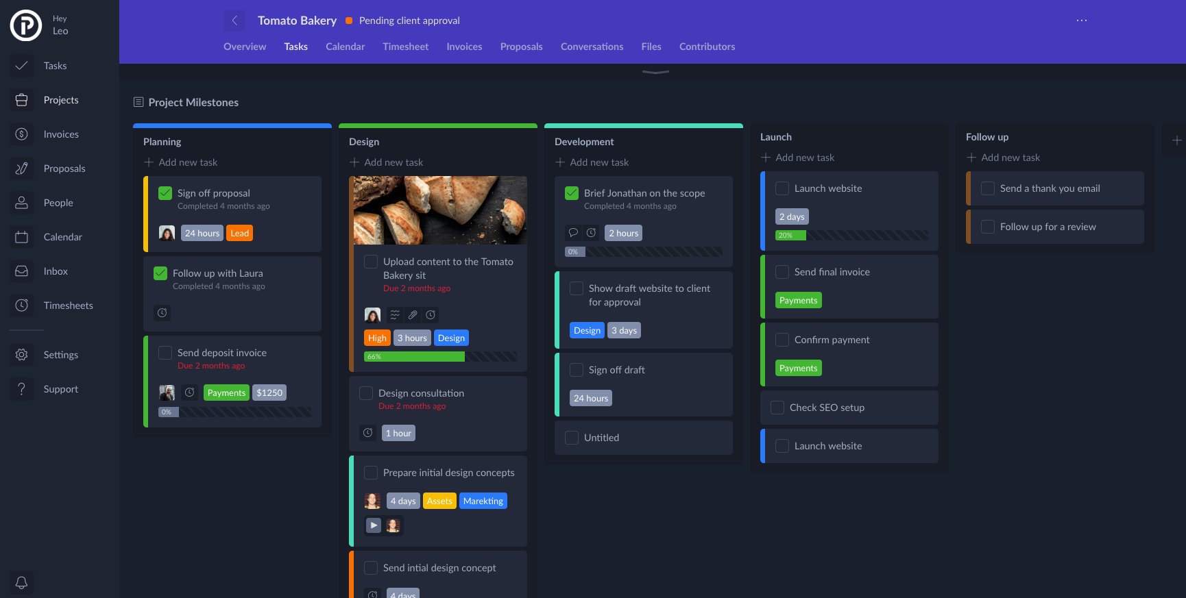
UI/UX 💩 / Feedback · June 25, 2019 at 6:09pmHey guys, this is my first post on here, I've just discovered this awesome community! Woop woop! - So, I've been working really hard on a dark mode version of our app Plutio.com - below is a screenshot of the final product, I would love your feedback, please.
July 2, 2019 at 8:45am
@leobassam @arthurshefner Check out this ultimate guide on Designing Dark Theme. I go into the very details and give real examples. https://blog.prototypr.io/how-to-design-a-dark-theme-for-your-android-app-3daeb264637
July 2, 2019 at 4:41pm
I like your design, its pretty and consistency. and I know it's a trend for dark mode, but I was just start to think about why we need dark mode. I heard a lot of people complaint that their eyes get so tired when they look at a white bg for a long time. And I think Spotify is a leader who start to use a night mode (actually they just transferred the entire app to dark bg.) but I was thinking about what feeling a dark mode bring to us? relax? entertainment? I do like your design, in a dark mode, all the colors pops up, but maybe a little bit chill for a productivity app? just my personal opinion.
July 3, 2019 at 7:21am
@hailey-liu dark mode is something I am seeking in every app for last 10 years, and its just now getting popular when main players like Twitter, YouTube, Twitch integrated it year ago.
Even one of our side projects have it moon.ly.
Dark mode is really crucial, especially when you spend your time late night in dark room, and you come to pure white website which literally burns your eyes. It happens to me, one period I couldn't even watch of website if its white bg, which forced me to install this Chrome Extension https://chrome.google.com/webstore/detail/dark-reader/eimadpbcbfnmbkopoojfekhnkhdbieeh
July 5, 2019 at 11:38am
@leobassam @arthurshefner Check out this ultimate guide on Designing Dark Theme. I go into the very details and give real examples. https://blog.prototypr.io/how-to-design-a-dark-theme-for-your-android-app-3daeb264637
Wow, absolutely amazing work on the article - thank you so much for sharing!
@hailey-liu dark mode is something I am seeking in every app for last 10 years, and its just now getting popular when main players like Twitter, YouTube, Twitch integrated it year ago.
Even one of our side projects have it moon.ly.
Dark mode is really crucial, especially when you spend your time late night in dark room, and you come to pure white website which literally burns your eyes. It happens to me, one period I couldn't even watch of website if its white bg, which forced me to install this Chrome Extension https://chrome.google.com/webstore/detail/dark-reader/eimadpbcbfnmbkopoojfekhnkhdbieeh
@hailey-liu, Stefan has perfectly answered this question.
Heaps of our users asked for a dark mood, i never really understood why until I started to use it myself!
It is so much easier on the eyes and I find it a bit calming.
July 6, 2019 at 3:22am
Dark Mode at various apps/OS https://github.com/wekan/wekan/wiki/Dark-Mode
July 6, 2019 at 9:33am
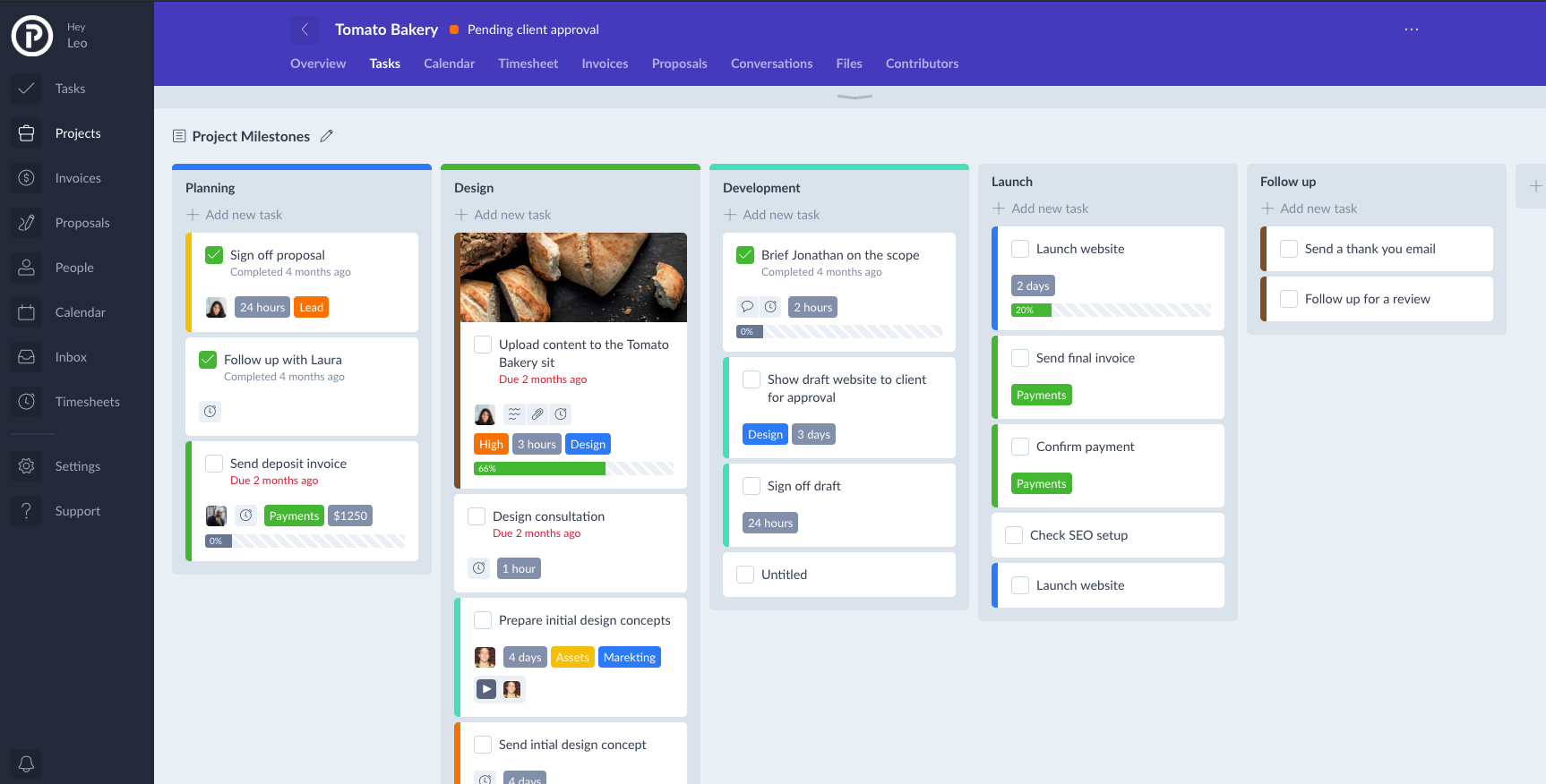
The design looks nice! But something I immediately notice is your text-to-background contrast looks too low. I suggest you use a lighter text color and also border color around check boxes. Here is a great tool for testing contrast: https://webaim.org/resources/contrastchecker/ another good tip is looking at your design while squinting your eyes. With a few tweaks I'd say you're there. Good luck! :D
July 7, 2019 at 3:14am
Wow, absolutely amazing work on the article - thank you so much for sharing!
You are welcome buddy!
The design looks nice! But something I immediately notice is your text-to-background contrast looks too low. I suggest you use a lighter text color and also border color around check boxes. Here is a great tool for testing contrast: https://webaim.org/resources/contrastchecker/ another good tip is looking at your design while squinting your eyes. With a few tweaks I'd say you're there. Good luck! :D
Yeah. I coved that in the article I mentioned above.