UI/UX 💩 / General
What do you think about this Seamless "Registering/Login" User Experience?
What do you think about this Seamless "Registering/Login" User Experience?
UI/UX 💩/General · November 2, 2019 at 6:24pmWhat do you think about this Seamless "Registering/Login" User Experience?
UI/UX 💩 / General · November 2, 2019 at 6:24pmI just stumbled upon this website called Practo and wanted to share a seamless user experience I had.
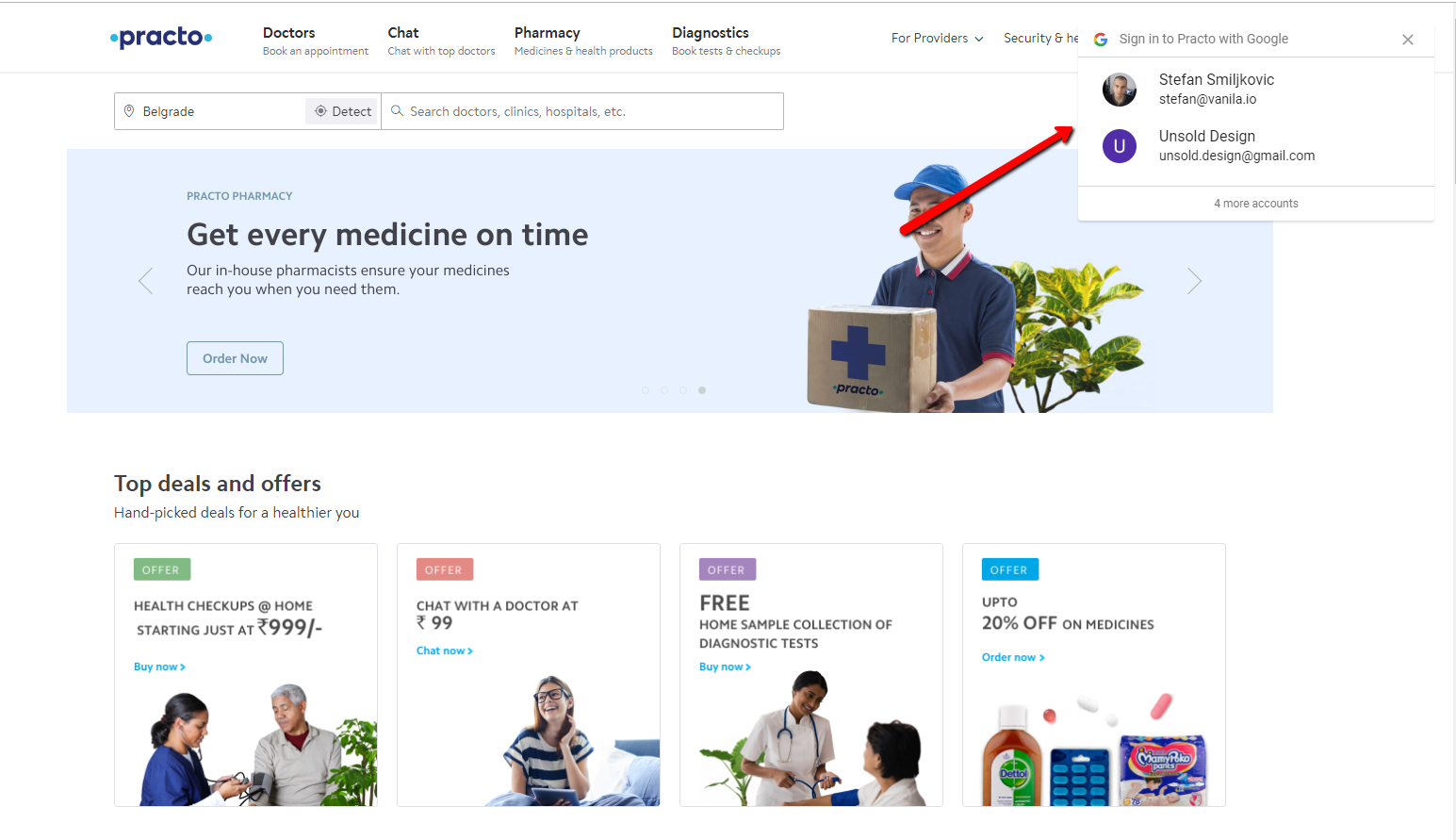
While I was scrolling the website, looking at clean UI, this tiny pop-up/dropdown caught my attention. It offered me to register using Google Accounts. As you can see on the screenshot below it instantly showed one of my email addresses. It even had the option to choose from more accounts if I clicked that text link.

I wanted to register on the website just to check the UX, even I am not interested in this service. It was just a reference site for a potential client.
So I clicked it and showed this dialog, CTA button asking to continue.

I clicked again, and I was already registered and logged in. All that happened without getting redirected to a different page or reloading.

What do you think about this Register / Login User Experience?
